Role: UX researcher and designer
Duration: June 2021 - August 2021
Project Overview:
As part of my UX internship with the City of Seattle, my team conducted a market analysis of city service. My team specifically focused on creating a usability assessment for affordableseattle.org, a department within the city. This usability assessment was then used to develop a white paper for UX research for the city, and suggest a redesign of the existing Affordable Seattle website.
The problem: Affordable programs offered by the city were going underutilized. The city aimed to understand why these programs were not being used, and sought a solution to improve utilization.
Research methods: User interviews and digital usability testing of our prototypes

Spreadsheet documenting all the services available on the City of Seattle website. We created a .csv file to make data visualization easier.
We began with indexing every service offered on seattle.gov, including complementary sites like affordableseattle.com. This services map was helpful later on in our project as well, as we identified 105 services available on seattle.gov as 'affordability services' that were missing from affordableseattle.org
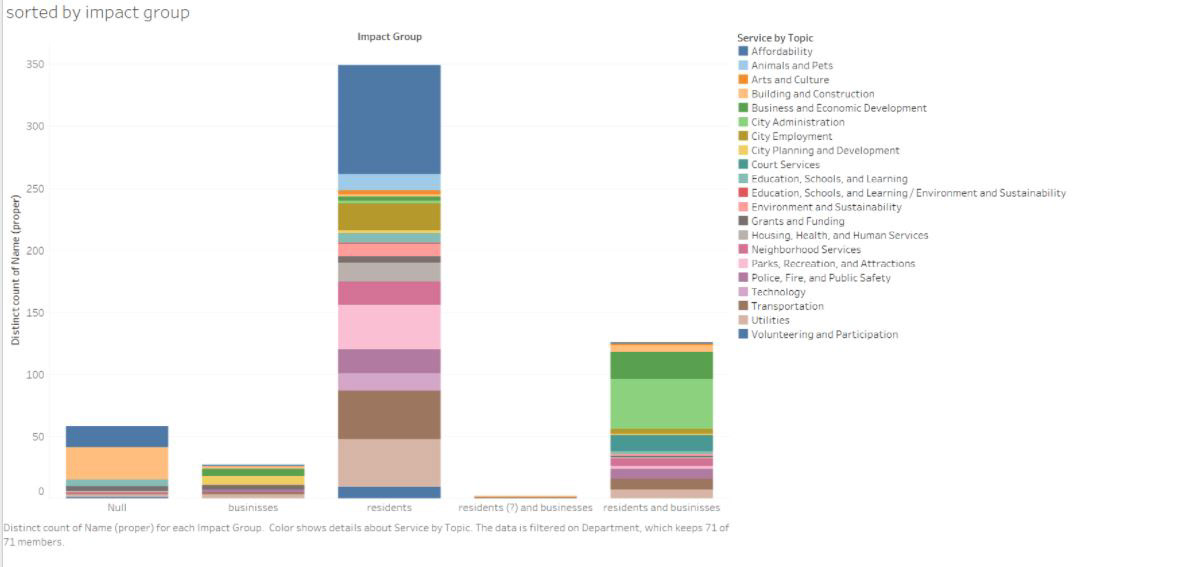
Using our excel sheet, we converted it to a .csv to create data visualizations in tableau. Above is an example of such a visualization, illustrating the number of services available for each impact group.
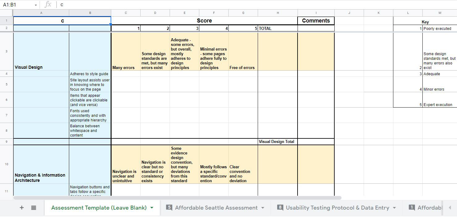
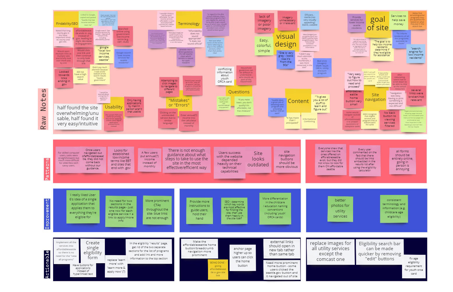
Our team then created a usability assessment with a 5 point scale to distinguish error levels. We gave affordableseattle.org a score 1-5 on each topic. We then began testing with users to complete the user testing category of the assessment. We struggled with finding members of our target audience due to COVID-19 restrictions, so our first round of testing was done with peers.
Their responses are listed below:
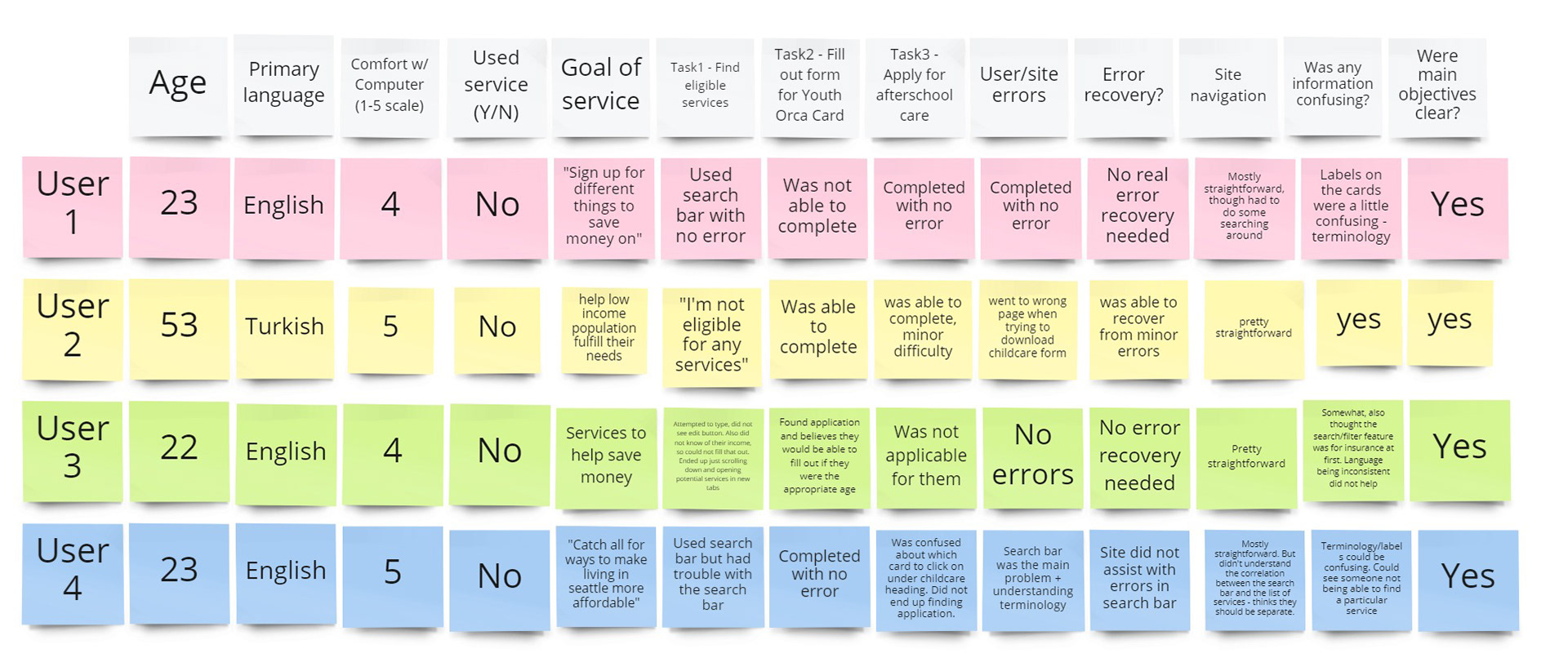
User feedback from our initial round of user testing
After testing affordableseattle.org with our peers, we compiled their feedback in Miro. This gave us a starting point to begin testing with our target audience.
From our testing, we gained some valuable insights to the usability of the platform, but we still needed to test with members of the target demographic. After consulting the UX team at the city, we transitioned our user testing protocol to a Userlytics survey. This survey included a screener to filter out users who were not part of the target audience. Our team had one member ask the user informational questions (written below on white sticky notes), while the other team members recorded their responses and number of clicks.
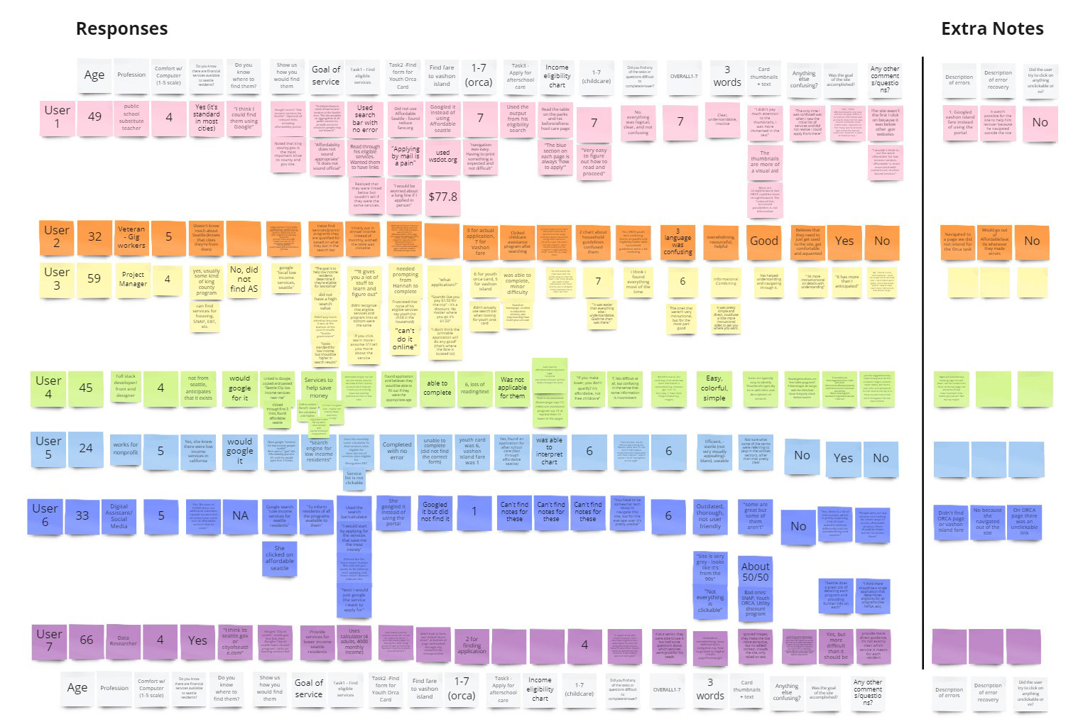
From the responses from our peers and the Userlytics data, we created an affinity diagram with actionable recommendations for the city.
A summary of our redesign recommendations can be seen below:
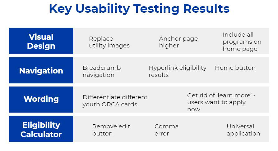
Our recommendations include replacing thumbnail images on affordableseattle.org, anchoring the page higher so users can see a breadcrumb navigation, and redesigning the eligibility calculator and results page. The eligibility calculator is a main feature of affordableseattle.org as it allows Seattle residents to discover money-saving programs and benefits they qualify for.
Redesign: Before and After
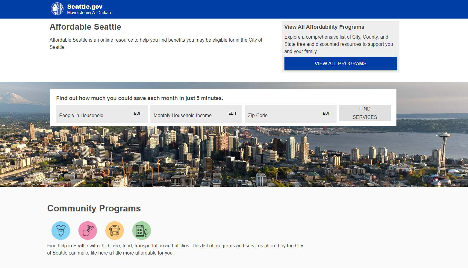
Here is the current (as of 08/24/2021) homepage of affordableseattle.org
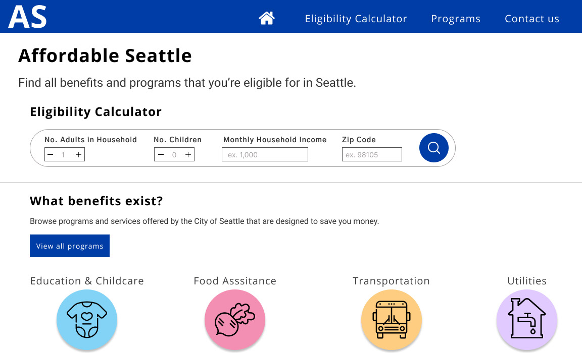
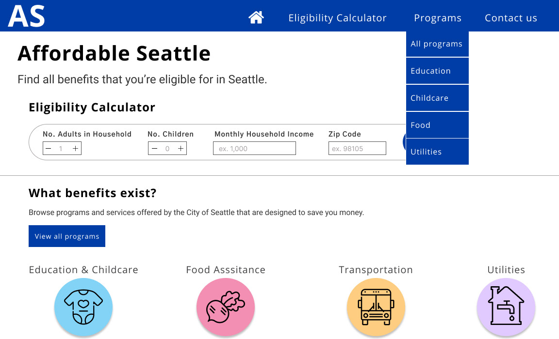
High fidelity wireframe of the home screen, including a new navigation bar at the top, two home buttons (home icon and the 'AS' logo in the top left), and a redesigned eligibility calculator.
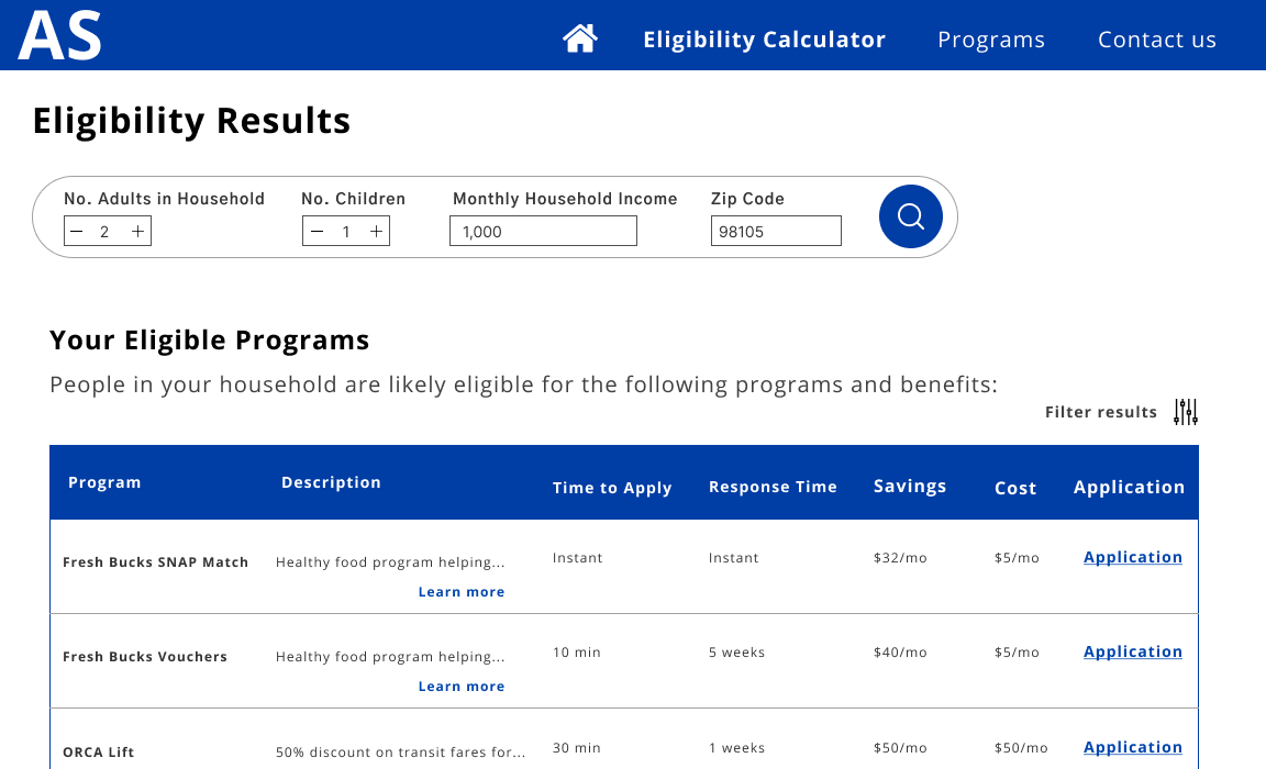
We also redesigned the page users see the programs they are eligible for. I included hyperlinks so users can apply directly from this page, as well as a description of the total cost of the program (instead of just the savings).
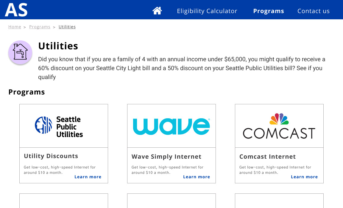
Updated Service Thumbnails
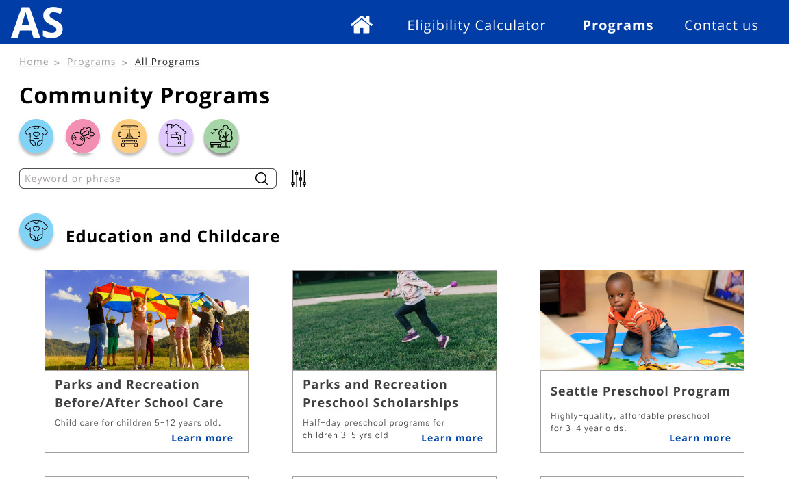
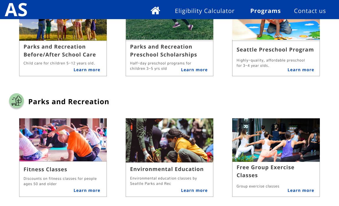
When we added all the missing services to affordableseattle.org, there was a new section that emerged: Parks and Recreation. We adjusted the information architecture of the site accordingly to make the new section of services easy to find.
Pitch to the City
After pitching these design ideas to the City of Seattle UX team, IT department, and Affordable Seattle managers, I am happy to say that our wireframes are being consulted as Affordable Seattle engineers the new and improved site! In addition, my team's usability assessment and user testing protocol have been submitted as white papers for future City use.