Role: Lead (sole) designer
Duration: July 2022 - July 2022 (3 weeks)
Project Overview:
This claims dashboard is used to summarize all the insurance claims filed by patients on the VNS Health insurance plan. This dashboard is used by C-Suite level executives to gain high level insight into KPIs of this department. The screenshots of the final product are censored to comply with company NDAs.
The problem:
Executives within VNS Health needed high level summaries of the insurance line of business, but existing reports were overwhelming, difficult to parse, and were spread across multiple dashboards. Our team needed to build a dashboard that contained all these reports, and still loaded quickly despite the volume of data being communicated.
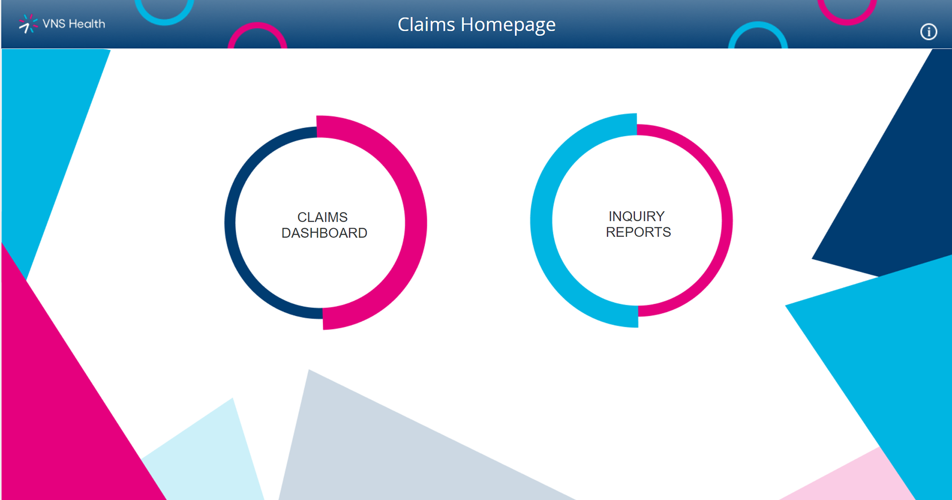
While dashboards at VNS Health do not usually have homepages, I added them to the larger dashboards I've built for navigational ease.
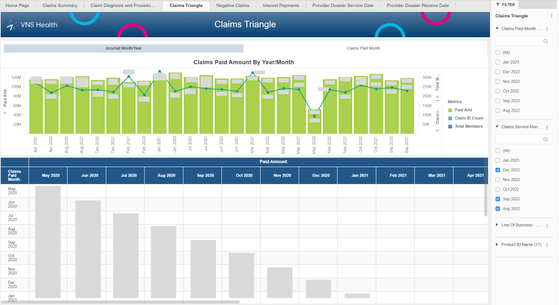
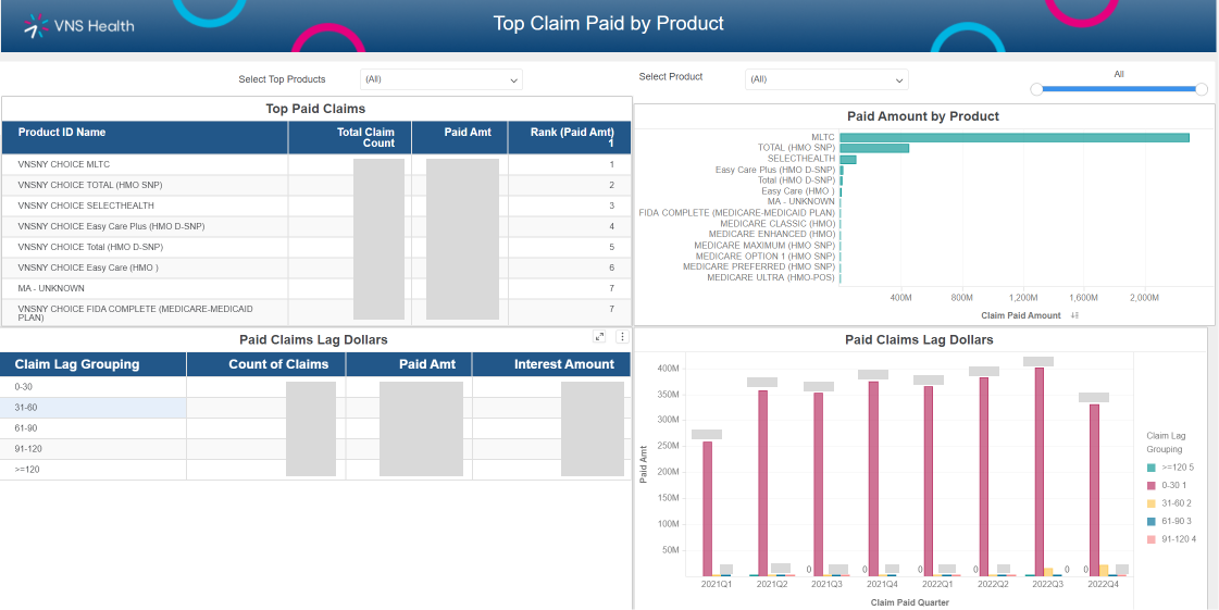
The first section of this dashboard is the Claims Summary chapter: this section covers multiple aspects of patient claims, including a high level summary page, top paid claims and denials, top claims paid by product, and a claim detail page.
I conducted extensive testing with key users to understand how they interacted with different claims reports to help me organize this dashboard. I also conducted A/B testing to see how users responded to different visual encoding of key data to help guide my design.
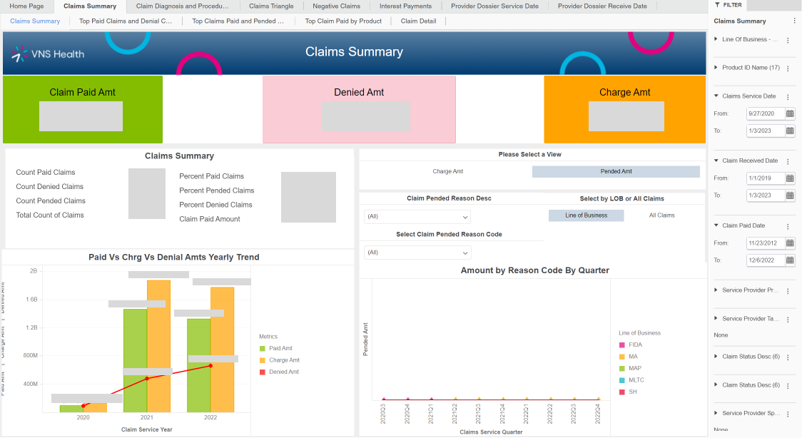
The claims summary tab was primarily used by C-Suite executives and the Health Plans SVP to get a high level summary of this line of business.
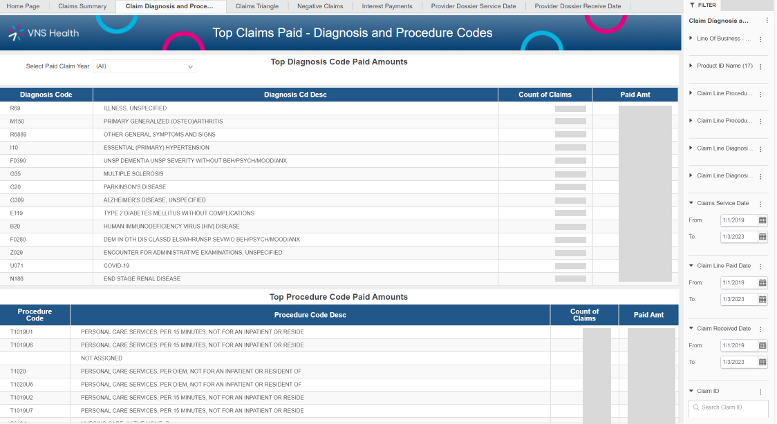
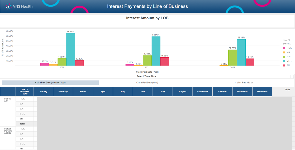
The next most requested report was the top diagnostic and procedure codes associated with the top paid claims. This helped users parse which services were most used by VNS Health customers.
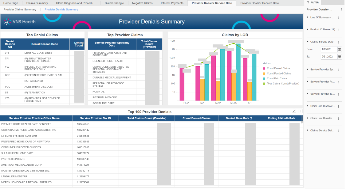
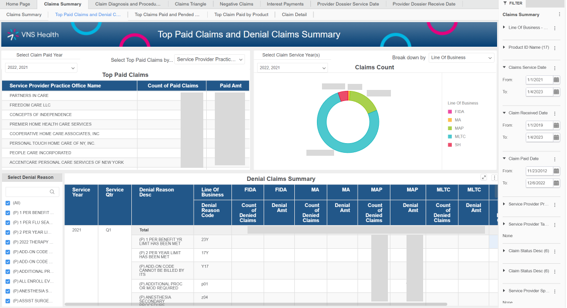
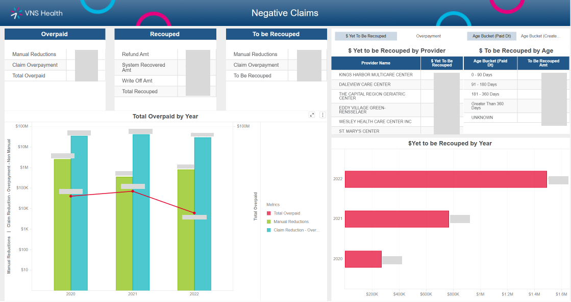
This report showed which providers denied the most claims, and drove decision making about which partner organizations to continue working with.
Looking Back:
Over the course of 3 weeks:
- I led qualitative user testing with 6 key users
- I generated 30 wireframes
- I facilitated 8 meetings
- Our team built and deployed our product
This dashboard was my first experience designing and building a dashboard in Microstrategy, and my first time leading a large project at VNS Health. I learned a lot about cross functional collaboration from this experience, and the importance of involving developers and data scientists early to prevent project delays.
Usability testing post deployment found that this dashboard reduced workload for the target users, and was used on a daily basis. This project also helped me develop the systems design of the organization and create a design library, as well as templates for dashboards.