Role: Lead UX designer
Team: 2 Product Managers, Technical Lead, Clinical Operations Lead, 2 Backend Engineers
Duration: April - August 2025 (18 weeks)
Project Overview:
AccessHope partners with companies to provide support to employees navigating cancer diagnoses. They provide a members only platform that allows users to get support throughout their treatment journey. I led the redesign of AccessHope’s Expert Advisory Review (EAR), a specialist second-opinion service for oncology patients navigating treatment decisions.
The goal was to improve clarity, reduce anxiety during long review periods, and strengthen long-term adoption of a clinically intensive feature.
The problem:
The EAR supported patients during one of the most stressful moments of their lives — cancer treatment decisions — but the experience created friction at critical points.
Key challenges:
Patients had little visibility into where they were in the review process.
- Reports were dense and clinically complex.
- 75% of users followed up with nurses for clarification.
- 53% downloaded reports, suggesting limited engagement post-delivery.
- Most users only requested EAR once.
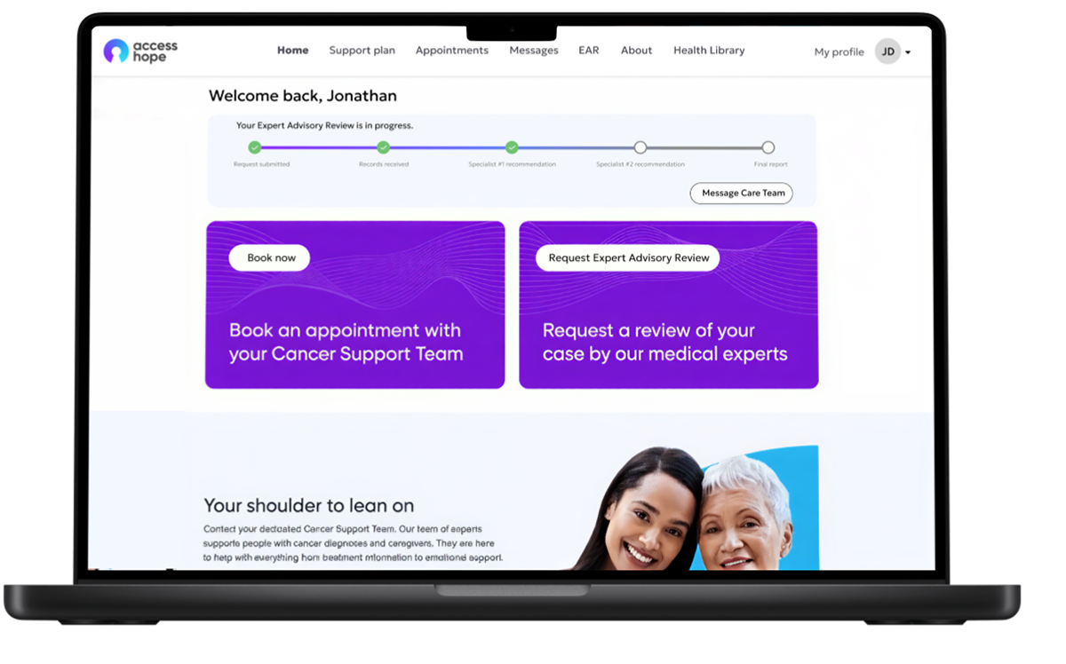
Before:
- No clear progress visibility, long waits for medical records were not communicated
- Unnecessary friction points in EAR request process
- EAR provided one expert NCI opinion
- EAR request CTA and updates were hard to find on patient portal
- Patients needed to search the resource library for articles relevant to their diagnosis and treatment
- Patients needed to download or share EAR report with their providers themselves

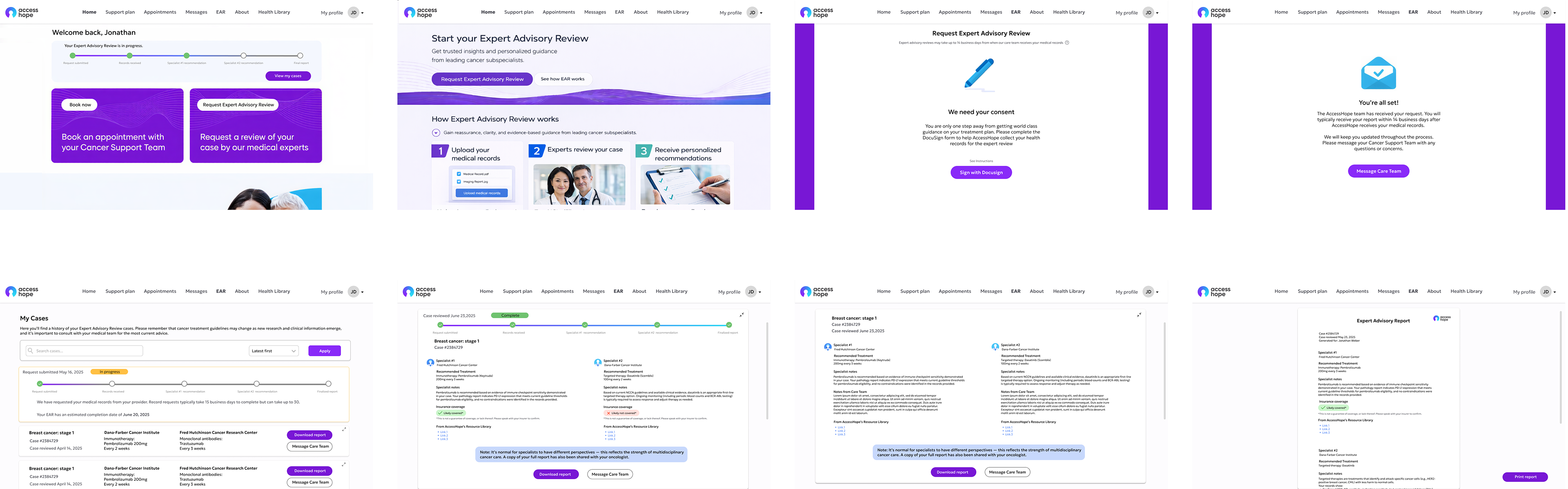
After:
- Clear multi-step progress tracker on homepage, with CTA to request new EAR
- Expectation setting on how long EAR process will take -- leading to reduced uncertainty during wait
- EAR report provides 2 expert opinions from NCI-affiliated oncologists
- Health library resources relevant to patient diagnosis and treatment options embedded in EAR report
- EAR report automatically shared with patient's care team
- Information about insurance coverage in final report to help patient feel fully informed about their treatment options
Takeaways:
- Transparency reduces anxiety more than speed alone.
Making progress visible was as impactful as shortening turnaround time.
Making progress visible was as impactful as shortening turnaround time.
- Structure builds trust.
Clear information hierarchy helped patients feel more confident — without oversimplifying clinical nuance.
Clear information hierarchy helped patients feel more confident — without oversimplifying clinical nuance.
- Perceived thoroughness can outweigh minor delays.
Adding depth (+2 days) strengthened credibility and long-term value.
Adding depth (+2 days) strengthened credibility and long-term value.
- Designing for healthcare means designing for interpretation.
The real UX challenge wasn’t delivering information — it was helping patients understand what it meant.
The real UX challenge wasn’t delivering information — it was helping patients understand what it meant.
- Support teams reveal hidden friction.
High care team follow-up rates exposed comprehension gaps the UI alone didn’t show.
High care team follow-up rates exposed comprehension gaps the UI alone didn’t show.
- Small writing changes carry large emotional impact.
Tone and framing meaningfully influenced patient confidence. UX writing is key for building patient trust.
Tone and framing meaningfully influenced patient confidence. UX writing is key for building patient trust.