Role: Lead (sole) UX designer
Duration: June 2022 - December 2022
Project Summary:
In 2022, VNSNY was rebranded to VNS Health. In this transition, I served as the Rebrand Ambassador and led rebranding efforts for my department, including redesigning approximately 100 existing products. I designed multiple landing pages for different lines of business within VNS Health, including the main landing page for my department, which is used by hundreds of business users daily. The below products are an example of the kind of redesign work I did. Some information is censored to comply with HIPAA and NDAs.
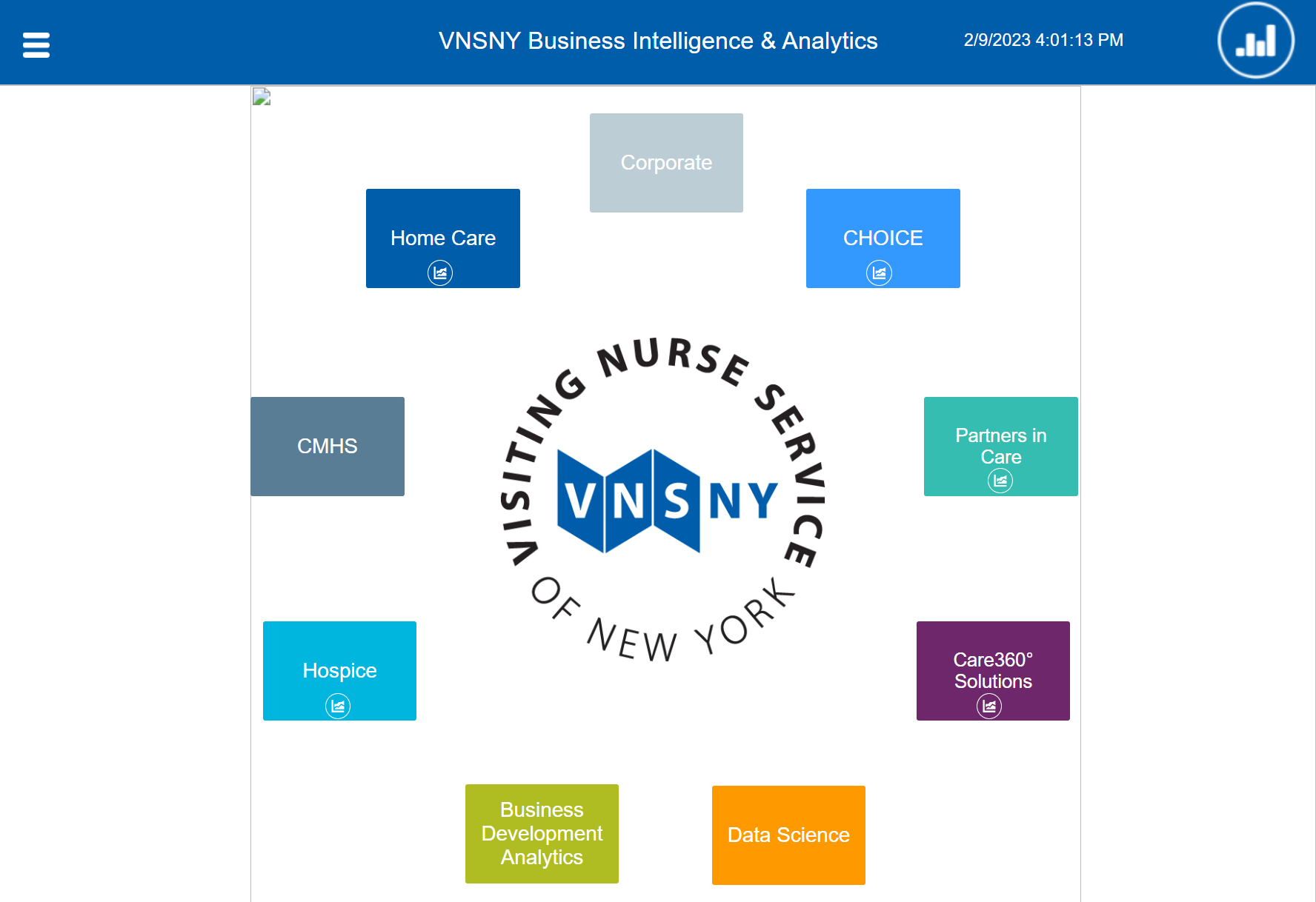
Original VNSNY BIA landing page
One of the first things I did was create a new design system that accommodated the changes from the rebrand in order to foster consistency across all new products. Consistency is extremely important when developing BI dashboards, as it instills confidence in the data for the users, and can communicate meaning through visual encoding.
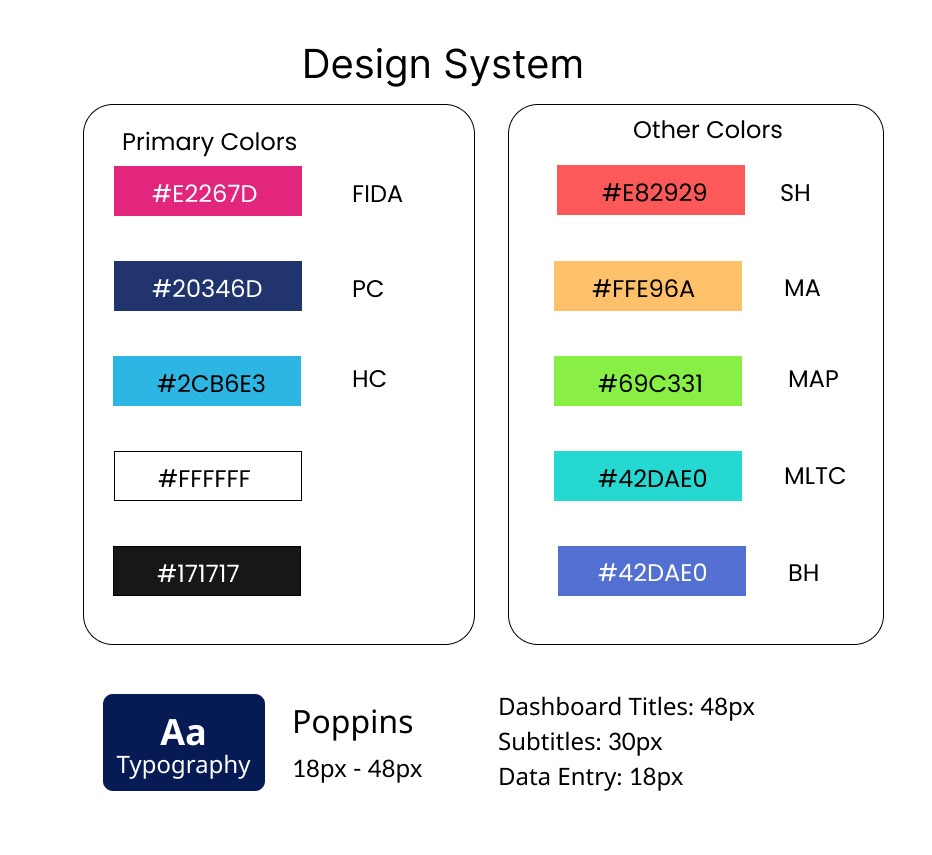
Sample of the first iteration of the new design system. Given that my department focused on information analytics, I focused on designating colors for different lines of business so data visualizations had consistency across products.
Below is the rebranded landing page that I designed and deployed.
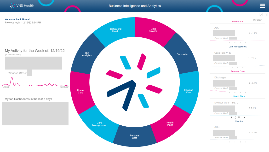
Above is the rebranded homepage for my department. The different lines of business are pictured in the ring chart; each sector is linked to the corresponding line of business's landing page. I chose to add critical KPIs on the right side of the page so users would have high level summaries of business outcomes. I also added an activity log on the right side of the page, so users can easily access their most frequently used dashboards.
When users click on a line of business (ex: Hospice Care), they are directed to the corresponding landing page. The old VNSNY landing page is pictured below:
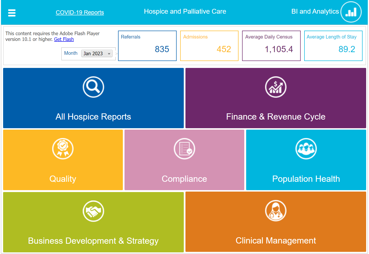
Old VNSNY Hospice Care landing page
In my rebranded iteration, the landing page contains more detailed KPIs on the left side of the page, as well as the different teams within this line of business. Users can click on a department (ex: population management) to see all the dashboards related to that department, or click on 'All Hospice Reports' and search for a dashboard.
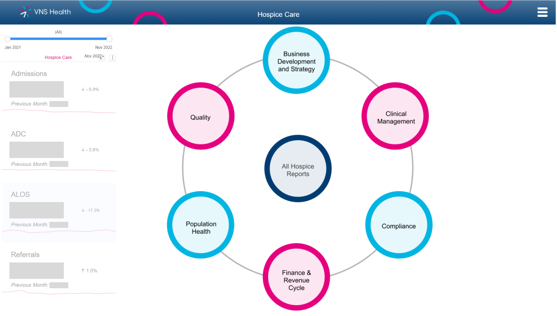
This is an example of a landing page for Hospice, a line of business within the organization. This page contains more detailed KPIs relating to hospice care (left), as well as the different teams within this line of business. Clicking on each department will reveal the reports related to that department; users can also click on 'All Hospice Reports' and search for a specific report.
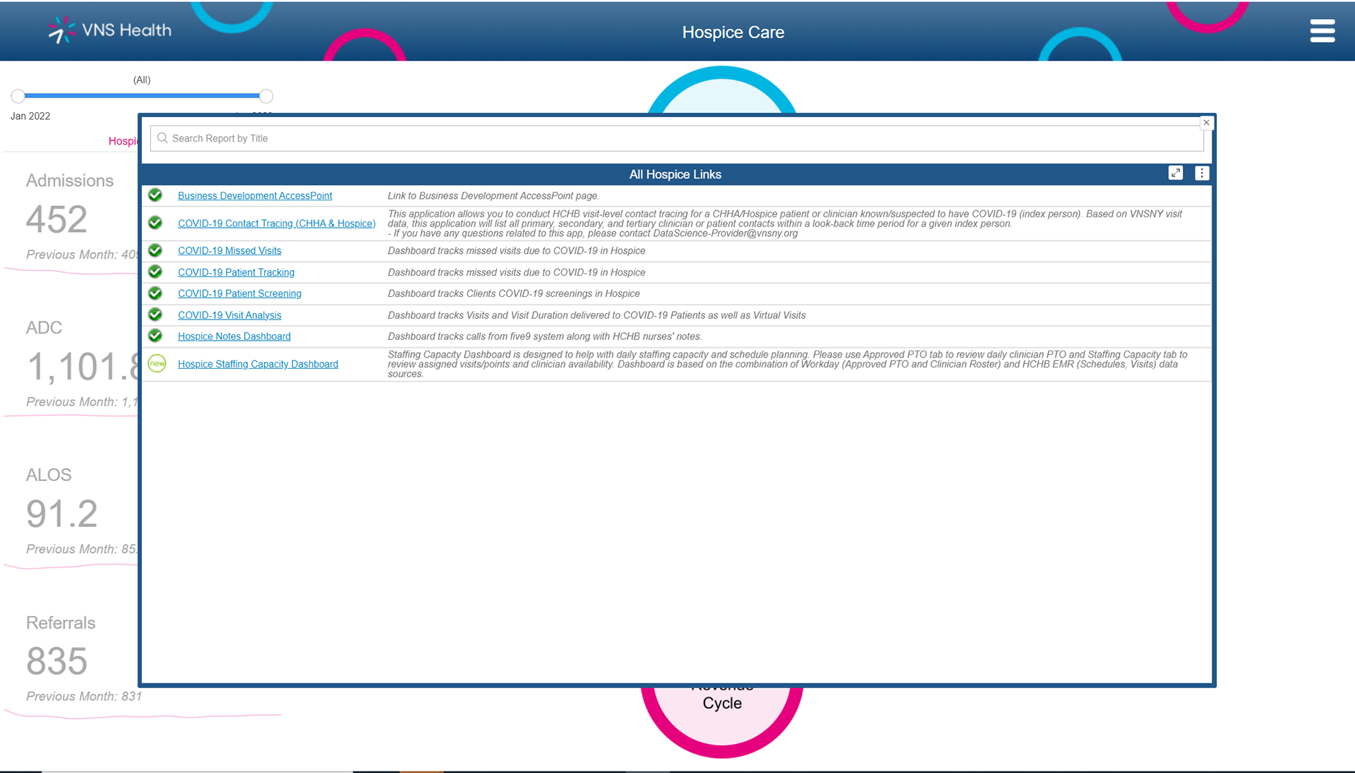
Below is the open menu of all the dashboard links within Hospice Care. The icons next to the dashboards indicate to the user whether the dashboard is operational, is less than 30 days old, or has a technical issue and is temporarily down (indicated by a red circle with an X)
Looking Back:
- I led a team of 6 developers to work on redesigning 107 products for VNS Health
- I managed the project from inception to deployment, and presented the final products to the entire IT/BIA department (80 people)
- I worked directly with the CIAO and spoke with the CEO to align UX goals with business goals
- Over the course of this project, I was able to make a more robust design library with icons and design guidelines to create consistency across products
The biggest constraints on this project was working within Microstrategy, a business intelligence/data visualization software to create navigational tools with responsive design. Responsive design was critical to this project because the CEO (a primary user of many BIA dashboards) had a vastly different screen resolution than the majority (80%-95%) of users. As such, I needed to use data visualization elements in order to create these navigational pages, because those were the only tools that were conducive to responsive design.